5 minute read
Building a new personal website
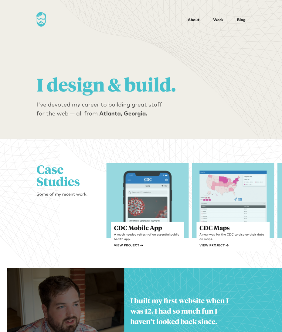
Yesterday I launched a new version of this website. When finishing big projects, I always experience this odd phenomenon where the final product just seems… simple and effortless. The end result doesn’t feel like something that took months of work and painstaking attention to detail. But that’s how it actually happened, and it feels great to finally complete it.
The impetus for this change was that I wanted to focus more on writing as opposed to having a traditional “portfolio” site. I think the utility of having work examples these days is questionable for anybody other than new developers trying to get their first job. Over the last 10 years, web development seems to have morphed from a somewhat creative endeavor into the more rigid “programmer” mold of a list of bullet points on your resume that you get drilled about in interviews.
But I get a lot of enjoyment out of reading blog posts from other people, especially the ones that rise to the top of Hacker News. I like writing comments there and wanted a comfortable space to write longer form material. I was frustrated by the blogging experience of my old site. The old design had featured images, so whenever I wanted to write a post I had to create an image to go with it. The design of the site wasn’t well suited to long form reading either. I wanted to eliminate that friction and update the look and feel of the site.

Gatsby
The biggest under the hood change is that I moved from WordPress to Gatsby. As of this writing, I’m still not 100% sure I made the right decision. There has been quite a lot of hype around static site generators in the last few years. Matt Mullenweg (the creator of WordPress) generated controversy when he said “JAMstack is a regression for the vast majority of the people adopting it” - but it’s plainly obvious that that is true.
First there’s the basic logistical stuff. You can’t just install a plugin if you want to do a contact form, you have to write the form markup yourself and connect it to a backend. It’s the same if you want an admin interface for someone who isn’t comfortable writing code to do content management. Solutions for all those things exist, but now instead of using a single open source backend you host yourself, you’re signing up for and relying on several different services that are all trying to make money off of you. It’s more complicated, more expensive and just flat out worse in most cases. This isn’t a huge problem for me and this site, but if I was still doing client work there’s no way I would choose Gatsby to build with.
Secondly — and this is the bigger and more worrisome aspect of this to me — is how much complexity Gatsby adds to regular websites. Using React components and routing enables advanced features like smooth page transitions and animations… but how many Gatsby sites actually employ those features? And how many newer developers are learning how to build inside of Gatsby without fully understanding the fundamental elements those frameworks abstract on top of?
To be clear, WordPress has a lot of its own baggage and problems that would make this post too long to go into. I don’t regret going with Gatsby because this is a personal project that I have full control over and maintain, but it’s important to acknowledge that the hot new framework isn’t always the best choice overall. That’s a lesson that is continually reenforced in my day to day life as a front end developer.
Inspiration
As much as I want to pretend that I create things in a vacuum, the truth is almost everything I produce is influenced in a lot of different ways. Both other websites but also music and visual art. I really enjoy the lush, stylistic typography that is making a big wave in web design these days. It almost feels retro/mid century modern to me.
Sites
- robsimpson.digital Big fan of the look and feel as well as the animations.
- daverupert.com Love the unique homepage and it’s not just a big list of posts.
- joshwcomeau.com Enjoy the site and the content.
- thelotoseaters.com Wish I had the confidence to design something this off the wall for my personal site.
Typefaces
Because I was creating a site focused on writing, emphasizing the text in the design was essential. The personality these typefaces lend the site had a large influence on the rest of the design.
I’m using Geograph and Tiempos Headline (which was also the main typeface from the previous iteration of this site) from the wonderful Klim Type Foundry. I’m using regular PT Serif for the main body typeface.
Soundtrack
For most of the time I was designing this site, I was listening to Flume. The dreamy electronic music definitely set the right mood for what I was trying to design, with vivid shapes floating around the screen in abstract patterns.
RSS & Socials
Similarly to how Gatsby is in some ways a regression, the disappearance of RSS from the internet has been a widely noted and decried phenomenon. I used to use RSS all the time but I also stopped when it fell out of favor. I made an intentional decision to offer an RSS feed with this site, with a persistent link in the footer. I wonder if it will get any use!
I also don’t use regular social media like Twitter or Facebook, but I came to the realization recently that I do use some social media sites that are less common but I get a lot of value out of. I added those to the homepage as well so I can hopefully connect with more people on there.